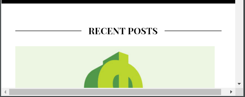
In the spirit of responsive web design, I try to make any site I work on look good on any device, while only maintaining one code base. None of this mobile website nonsense! I’m constantly resizing my browser to ensure the design looks good at any width. If a horizontal scroll bar appears, my #1 priority will be to dig into the CSS and to remove this behavior.
I can only think of a few cases where a horizontal scroll bar is appropriate on a web page. Perhaps there is a long single-line code snippet that needs to be displayed. Or a large resolution image that can be zoomed in on and inspected with more detail. In most other cases, a horizontal scroll bar is usually a sign of malformed CSS and should be sought out and destroyed!
The base WordPress theme I chose for this site generates a horizontal scroll bar when the viewport is shrunk past a certain width. I can’t allow this.

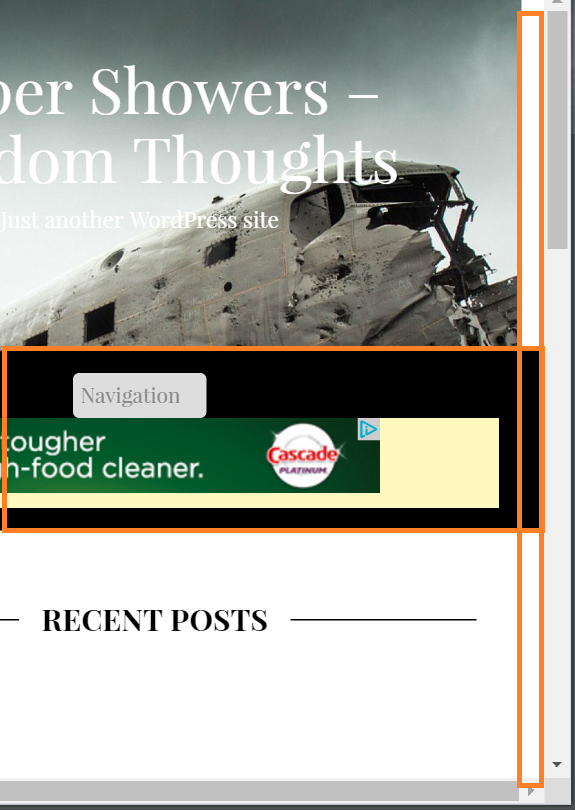
Horizontal scroll bars are generated when an element on the page has a defined width, and the viewport width is less than the element’s width. To track this issue down, I scroll the bar all the way to the right and observe any elements on the page that still show up on the righter most column of the viewable area.

Aha! The highlighted black box in the image above is pushing the width of the page too far to the right. No other element exists in this space, so the horizontal scroll bars must be appearing because of the black box element.
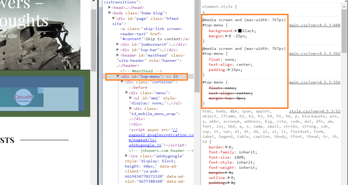
Time to dig into the CSS. I open my browser’s developer tools (f12) and inspect the element causing the issue.

This line of CSS is the culprit:
[code language=”css”]
margin: 0 -25px;
[/code]
This defines the element to have both a negative margin on the right and left sides. However, the contents of the element also are defined to take up 100% of the page width. The browser interprets this as content that is outside of the bounds of the viewport and therefore generates the horizontal scroll bar to accompany this overflowing content.
It is akin to me trying on jeans that are extremely too tight for me, and my contents (body fat) creating a muffin top that flows out on the sides anyway. Sure, I’m wearing 26″ skinny jeans, but I’m just displacing my mass to a different area and it looks awful.
After removing the negative margin defined on the element in my CSS, I no longer am able to generate horizontal scroll bars at any viewport width, and the world is now a better place.
